
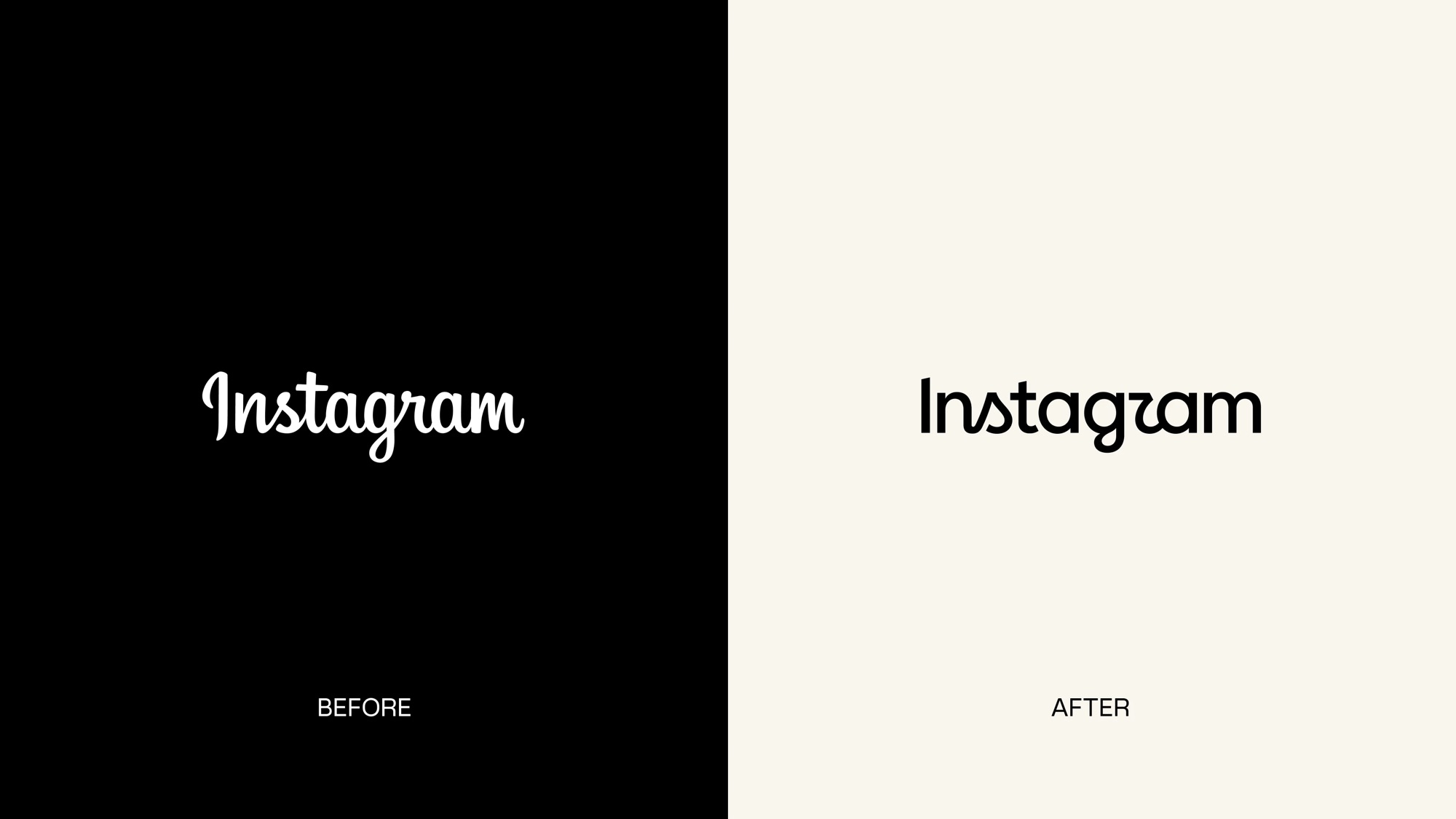

Instagram just swapped its wordmark (that’s the text logo, not the camera icon) for the first time in 10 years. Here’s what happened and why.
What they actually changed
So I’ve been on Instagram for a long time, same account since 2008 or so. I remember when it was changed the first time. Now, in 2026, it’s time for another change.
For a decade, “Instagram” at the top of your feed was written in a loopy, cursive script. This is now gone. The new version is mostly a print-style font but keeps hints of the old script: the “n” and “s” connect, and the “r” and “g” still have playful curved swooshes. Think of it like a kid who used to write every letter in cursive and now only cursive-connects a couple of letters, printing the rest.
The shift also nudges Instagram’s look closer to its sibling apps Facebook and Threads, since sans-serif lettering now shows up across all of them. This is something that makes perfect sense. It’s a strategic move because its isn’t really about Instagram anymore. It’s about Meta wanting its family of apps to visually match, the way Google’s apps all share a similar font and color language.
Mosseri (the Instagram’s head) explained the reasoning himself that wordmark hadn’t changed in 10 years, so it was time for a refresh. He described it as “cleaner and more modern, with references to the original and the simplicity and craft that’s always made it Instagram.”
What I think, as someone who does this for a living
The first I noticed is that the new lettering reads as “Instagzam” instead of “Instagram,” because of how the new “r” is shaped. I see that people agree. The thing I know about branding is that a wordmark that’s seen daily by millions becomes almost invisible through familiarity but if you change a few curves and maybe even the size and suddenly everyone is looking at it again. Whether that was intentional or not, Instagram accidentally made its own name interesting again.
This is a textbook case of the gap between “modern” and “clear.” The redesigned logo tries to hold onto personality while reading as more organized but the fact that “Instagzam” jokes are the loudest reaction proves legibility took a hit. The old wordmark had flaws, but nobody misread it.
Here’s the lesson I want you to take from this, because it applies to your brand at any size: recognition and cleverness aren’t the same goal, and when you chase both at once, you often lose recognition first. Instagram can survive a rocky logo week because 3 billion people already know who they are. The name recognition is doing the heavy lifting the logo doesn’t have to do anymore. Most of my clients don’t have that luxury. If your wordmark makes someone pause to decode it, that’s a half-second of doubt working against you before they’ve even read your offer.
Impact on Instagram’s future?
This will fade from the conversation in a couple weeks, and most casual users won’t consciously register the change at all. The bigger signal is Meta tightening its visual family across Facebook, Instagram, and Threads. That’s the actual strategy that’s playing out, and it’s worth watching for what it says about how Meta wants to be perceived as one connected ecosystem rather than separate apps.
Leave a Reply